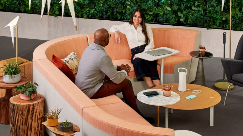
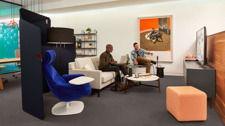
Walk into many offices today and you might think you’re in a trendy cafe or boutique hotel. To attract the best and the brightest many companies are creating an “anti-office” — a more relaxed and energetic environment that contrasts with the more formidable and conventional approaches organizations favored in the past. To capture the vibe created by Silicon Valley and high-tech startups, some have strayed into gimmicky touches like merry-go-rounds and slides that feel more like a playground than a workplace. And the furnishings, right out of the pages of design magazines, that would look great in your living room are everywhere — not just in the lobby.
These casual shared spaces — referred to in a variety of ways (resimercial, ancillary, lounge settings, informal spaces, loose furnishings) — have become popular and important places to get work done. Steelcase’s Global Study of Informal Workspaces confirms the need to remix the office — the data shows employees prefer to work in a range of spaces, rather than a single setting. And, as organizations become more matrixed and people are more mobile, organizations have responded by reducing the floor space dedicated to individual workstations and replaced them with a range of spaces: cafés, informal meeting areas, lounge spaces, private enclaves, meeting rooms and social spaces.
Despite significant investments to create inspiring workplaces that will attract talent, many of these more casual and fun workspaces sit empty.
Yet, despite significant investments to create inspiring workplaces that will attract talent, especially the highly-sought-after Millennials, many of these more casual and fun workspaces sit empty, while others are in constant use. The question is why? Why do people choose one space over another? Is there a right formula for creating these spaces? Given the time and investment it takes, how can organizations get it right the first time?
Form Meets Function
“Most of the time, the primary driver for shared spaces is aesthetics,” says Steelcase Applications Design Manager Mary Elaine Roush. “But organizations need to use every square foot in a meaningful way, so these spaces need to also be productive. People need more than a beautiful sofa and a coffee table.”
The key, according to Roush, is providing people with a mix of diverse spaces that support different work modes and styles. “Whether it’s an informal meeting over coffee, a brainstorm session with a small group or individual or heads-down focus work, these spaces need to be designed with performance in mind,” says Roush.
This may be why employees of large corporations are only moderately satisfied with the shared spaces their organizations provide them. “When we conducted experiments to learn more about the types of spaces people actually wanted, we discovered they may like the aesthetics and the coffee shop vibe, but they’ll only use spaces that are functional and help them get their work done,” says Roush.
Verda Alexander, co-founder, Studio O+A, San Francisco, agrees. According to Alexander, organizations spend a lot of their energy and focus on trying to make the workplace more comfortable and fun by adding ping pong tables, gyms, yoga rooms and meditation rooms. These amenities can help build culture and promote rejuvenation, but we also need spaces to get work done, says Alexander. Organizations need to turn their focus toward “reducing what’s unnecessary and getting back to a focus on work,” she says.
What’s Driving Performance?
The demands on the workplace have never been greater. As people spend more time working in teams it’s taking them longer to find a place to meet, putting a strain on meeting rooms. The result is a higher requirement for all spaces to support collaboration “on demand.” The problem is that they need access to spaces that support diverse activities but many shared spaces are designed primarily for social interactions and provide limited performance. Unable to find the right space for doing heads down work, it’s not unusual, for example, to find people doing focus work in large spaces designed for collaboration or trying to collaborate in areas designed for respite.
“People come to the office to work,” says Andrew Kim, WorkSpace Futures manager. “Behavioral data suggests that they have a tendency to choose shared spaces that provide a certain level of performance. Two aspects that we found are important to users when choosing a shared space are some level of shielding and appropriate postural support for their work and tools. Survey data confirms these learnings as well.”
To better understand the spatial attributes that drive occupancy and use, Steelcase researchers and designers conducted 23 experiments in multiple facilities. The experiments compared usage of side-by-side spaces that were identical, except for one attribute.
“These experiments confirm we have to start applying the same level of scrutiny to the details in these spaces as we do when we design workstations for individual work,” says Roush. “What work mode is the space intended to support and what amenities support that work? Does it provide enough worksurface space, does it give people equal access to power, is the seating height compatible with the worksurface height? This is what will elevate or activate the performance in these spaces. Despite where the work happens, the needs don’t change. So why would you design spaces away from the desk without considering those needs?” she asks.
Six Key Drivers
Similar results were confirmed by a separate study conducted by Steelcase when new shared spaces were added at Little Diversified Architecture’s office in Washington D.C. (Read the Little Diversified Architecture case study for details about this research). These experiments and other research from observation studies, surveys and sensor data identify six key drivers that increase the use of shared spaces:

Task-Oriented Amenities
People prefer spaces with amenities similar to those they would find at their primary workstation (i.e. appropriate seating that supports a range of duration, digital displays, power, etc.); yet informal spaces often provide limited posture support.

Working Surfaces
It’s important that surface(s) support(s) both work and people’s belongings, which few spaces offer.
Access to Power
People are more likely to work in a space where power is available and easily accessible, especially for individual and long-term use; architectural conditions often dictate how easily power can be accommodated and it can often be overlooked. Regardless of estimated duration, power remains a ubiquitous need for workers.

Privacy
We naturally gravitate toward areas that provide some level of privacy; whether it’s visual, acoustical or territorial.

Permission
People need to feel that it’s okay to adjust the space based on their needs, yet many times it’s not an option or feels like it’s not acceptable.
Context
Location often determines use. It’s important that shared spaces are in close proximity to people’s work zone and colleagues when they need to stay connected. Destination spaces are important when people want to get away and escape.
Making Work Feel More Comfortable
When it comes to designing shared spaces it’s important to think about how these spaces will support all five work modes—focus, socialize, collaborate, learn and rejuvenate. Since people perform different tasks and a range of activities throughout the day, no one space can support them all. But every space needs to help people be more productive.
“You have to design with the intention to help teams and individuals work more productively no matter what they’re doing,” explains Roush. “You can’t expect teams to effectively collaborate if the space does not provide them with the proper tools or enough privacy. Similarly, if someone needs to get away to rejuvenate, it’s hard if the only spaces available to them are busy cafes.”
Every space needs to help people be more productive and create a sense of psychological comfort.
To be successful, shared spaces also need to create a sense of psychological comfort, where people feel relaxed and at ease. “It’s hard to have good social interactions with people if we don’t feel safe,” says “Joyful” author and designer Ingrid Fetell Lee. “A lot of office environments have subtle unconscious things that make us feel less safe. Very open offices where people feel exposed can trigger a sense of a lack of safety. ‘Prospect and refuge’ is an idea coined by the British geographer Jay Appleton, and it explained why we like looking at really open landscapes that have little clusters of bushes and trees in them. We love that feeling of being able to see and get a sense of everything that’s going on, but we also need refuge. People need to feel protected and have a sense of safety. If we feel like we’re an animal in an open field, then that’s going to affect our interactions with other people.”
 Open image tooltip
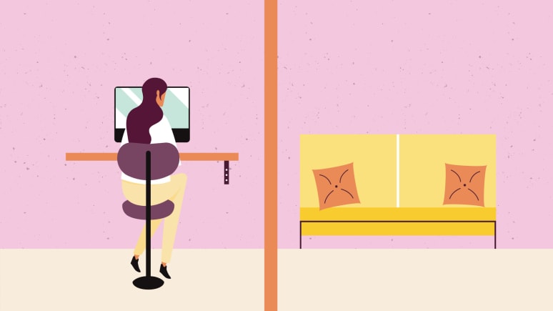
 Privacy
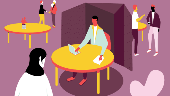
- Acoustical Privacy: Do you have access to private spaces where you can't be heard, when necessary?
- Visual Privacy: Can you be seen by others? Can you free yourself from sight-induced distractions?
- Territorial Privacy: Can you claim a space and control it as your own?
- Informational Privacy: Can you keep content (analog and digital) or a conversation confidential?
 Open image tooltip
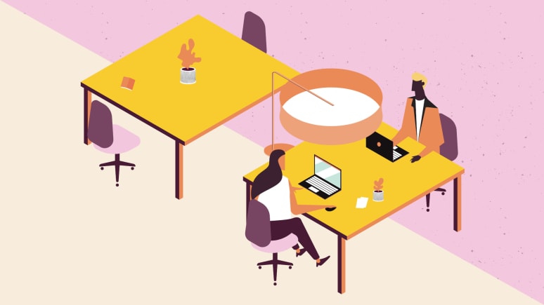
 Posture
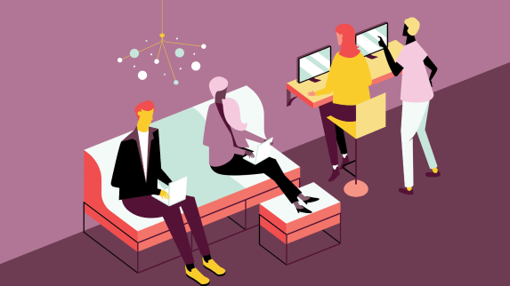
- Do you have access to a range of postures? Seated. Stool Height. Lounging.
- Perching. Different postures enable different kinds of work to happen more effectively.
 Open image tooltip
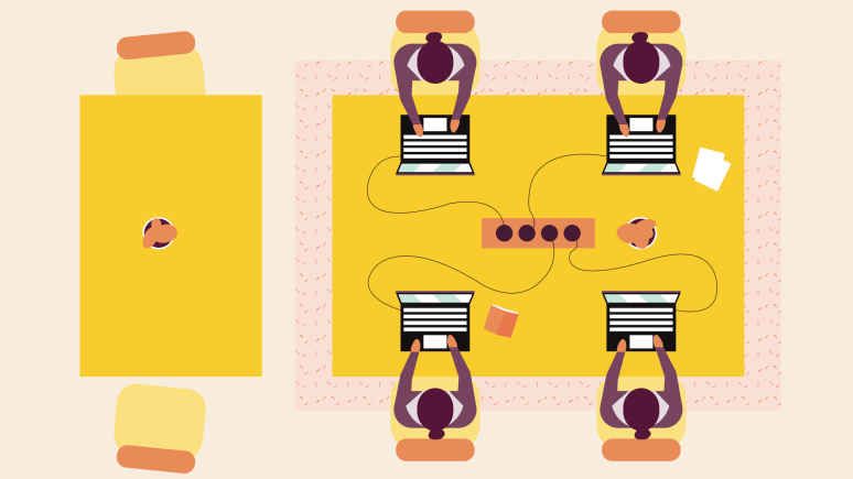
 Proximity
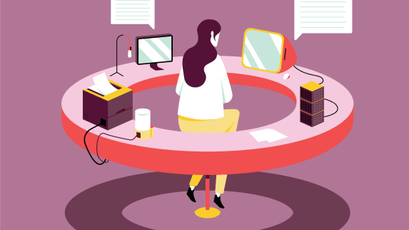
- People-to-People: Can people make eye contact and are they a comfortable distance from one another?
- People-to-Technology + Tools: Do you have easy access to the tools and technology you need to get work done?
- Furniture-to-Furniture + Space: Does the furniture work well together? Is the setting located in an area appropriate for the type of work being done?
 Open image tooltip
 Personality
- Does the space help set the tone for your organization’s brand and culture?
Activating Performance
Privacy
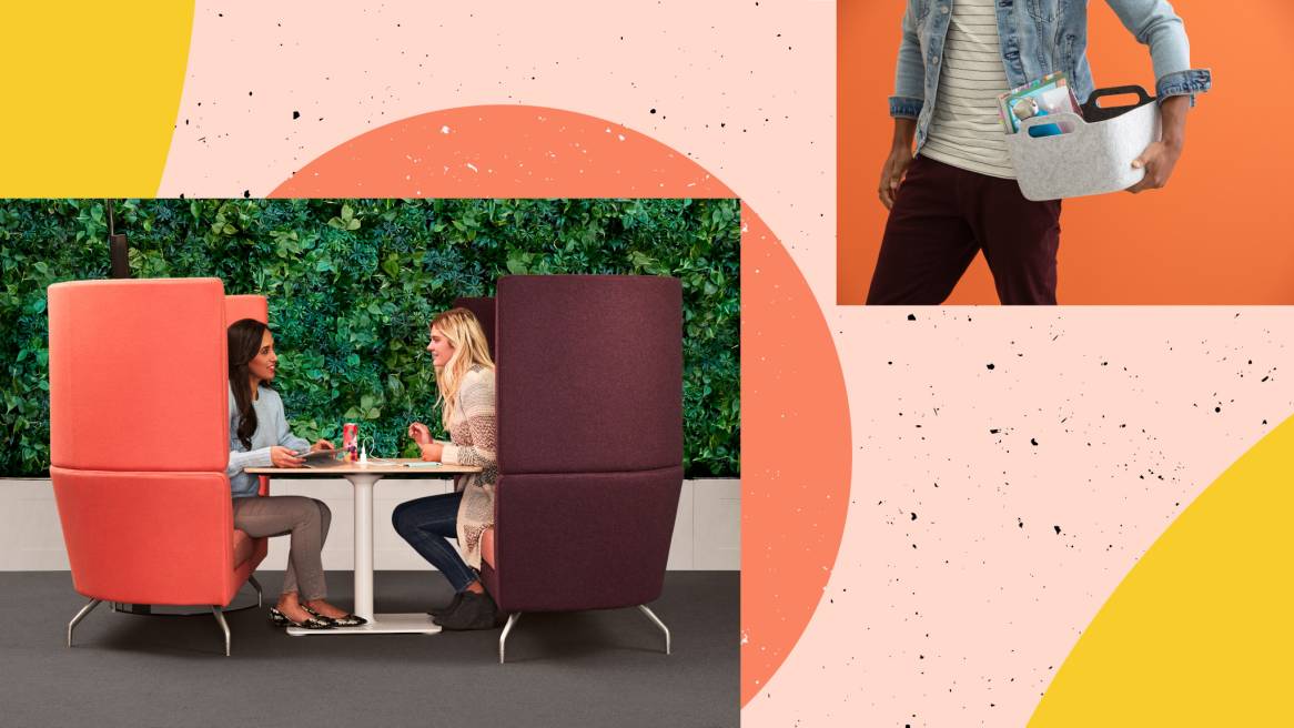
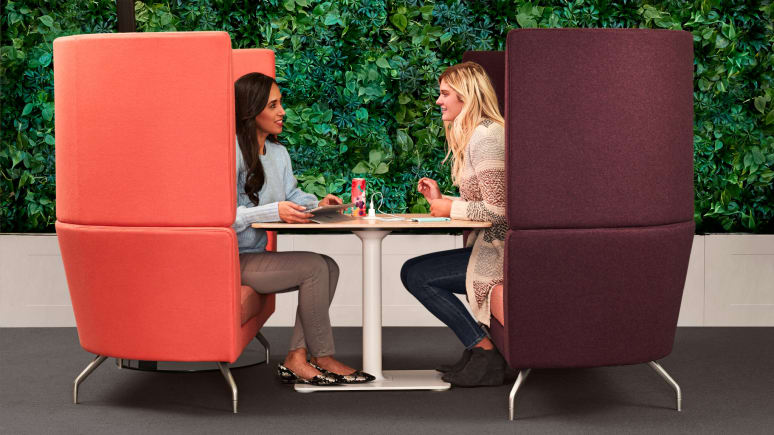
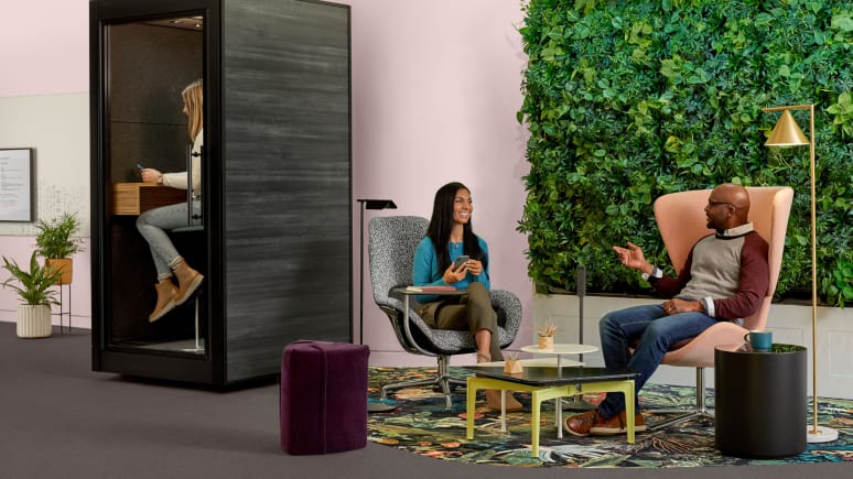
Provide the appropriate levels and types of privacy needed for the work being done. No matter where work happens, workers need to have a sense of security and the right level of privacy appropriate to their work and workstyle. “Privacy isn’t always about four walls and a door,” explains Roush. “Territorial privacy can be accomplished by a change of flooring and rugs to define boundary and protect workflow. Visual privacy is important to shield and protect the work going on while blocking sightlines that lead to distractions. Acoustics is another dimension of privacy that should be part of your shared spaces ecosystem to support users and groups when the work needs it.
 Open image tooltip
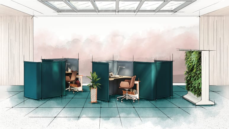
 After
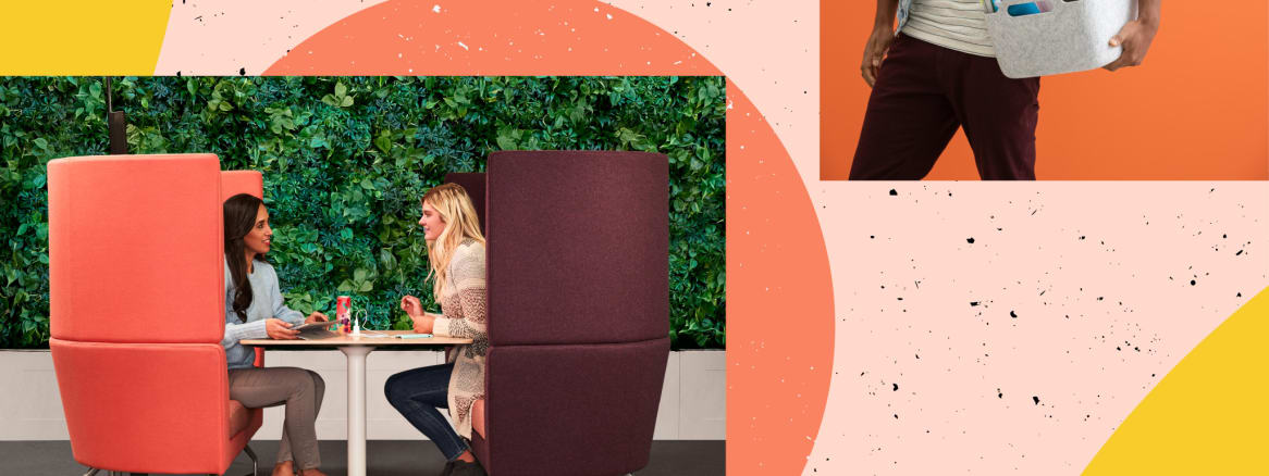
Intentionally planned furniture adjacencies protect users. The Sagegreenlife Living Partition provides additional privacy while also bringing greenery into the space for a calming ambience. Amenities like the Soto Bag Caddy provide users with storage space to keep their tools and personal belongings nearby.
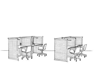 Open image tooltip
 Before
This setting previously failed to provide users with space to stow their belongings or the level of privacy they needed to maintain focus.
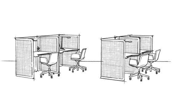 Open image tooltip
 Before
This setting previously failed to provide users with space to stow their belongings or the level of privacy they needed to maintain focus.
 Open image tooltip
 After
Intentionally planned furniture adjacencies protect users. The Sagegreenlife Living Partition provides additional privacy while also bringing greenery into the space for a calming ambience. Amenities like the Soto Bag Caddy provide users with storage space to keep their tools and personal belongings nearby.
Things to consider
- Is the user’s back protected or shielded?
- Does the orientation of the seating help the user feel protected?
- Does the space allow individual and group information to be shielded from surrounding spaces?
- Do the users have access to spaces with acoustic privacy?
Posture
Support the body in a posture appropriate for the task, whether seated, stool-height, lounge or standing. Today, very few people spend all day in the same chair at the same desk. This is a welcome change, reducing the physical stress that affects productivity, health and wellbeing. Different postures enable different kinds of work to happen more effectively. This means you have to provide a range of postures across shared spaces. People are sitting in longer durations away from the desk, making comfort in these spaces even more important.
“If you want to promote specific behaviors in a space, you need to think about what posture can help you do that. For example, if you want to enable a more active style of collaboration consider a space that supports standing postures,” explains Roush. “If the space is intended for long term deep focus work, a high performance task chair should be used. Spaces designed for social connections would benefit from a more relaxed posture that lounge seating provides.”
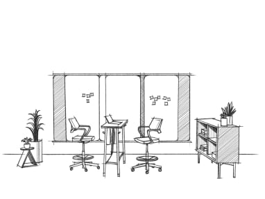 Open image tooltip
 Before
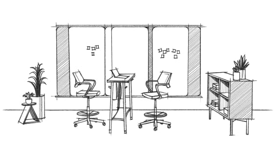
This setting needed to provide additional flexibility and mobility to allow users to move and participate more fully.
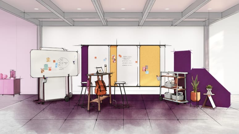 Open image tooltip
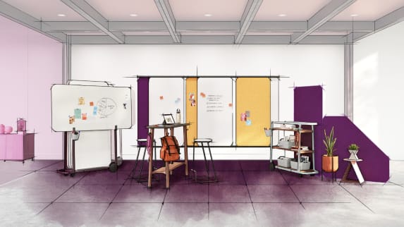
 After
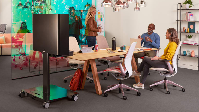
Steelcase Flex Slim Table allows everyone to contribute equally and maintain eye contact, while flexible furniture gives users the ability to create the space they need and take their content with them.
 Open image tooltip
 Before
In this setting, users needed more tools to visually display their work and ways to provide additional privacy.
 Open image tooltip
 After
Steelcase Flex Slim Table allows everyone to contribute equally and maintain eye contact, while flexible furniture gives users the ability to create the space they need and take their content with them.
Things to consider
- Does the seating allow equal participation for all users?
- Does the posture promote the behavior you are trying to achieve?
- Do you provide a range of postures across your shared spaces?
Proximity
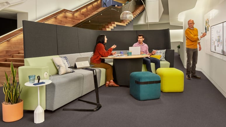
Intentionally plan the relationships between people, their tools, the furniture and the overall space. With so many choices that designers have today, the possibilities for how to design shared spaces is endless but this also makes it more difficult to do well, according to Roush. Greater diligence to addressing proximity issues is required. “You really have to think about the relationship between people in the space, access to the technology and tools they’ll need, how the furniture pieces actually work together and, finally, where the space is located in the overall floorplan to be successful,” says Roush.
“Much like you would host someone in your living room, you need to arrange these spaces so that users feel comfortable and welcome. In order to promote good conversation you have to create a space that allows everyone to participate equally. It should also provide a comfortable distance between people,” says Roush. For example, highly varying seat heights can cause awkward social experiences—a consequence of the growing amount of choice. Seat heights should be consistent to promote comfortable eye contact. It is also equally important to provide the right tools and technology in the space to support the behavior you’re trying to encourage. People need easy access to these tools, which include digital and analog displays to share content or brainstorm.
 Open image tooltip
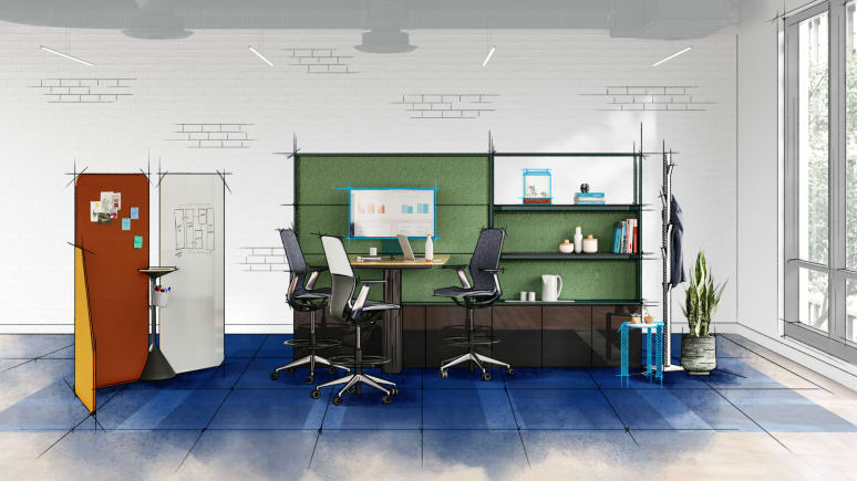
 After
Steelcase Flex Screens provide shielding for displayed content while offering flexible control. Convenient access to collaborative tools and power promotes equal participation.
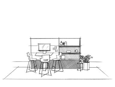 Open image tooltip
 Before
In this setting, users needed more tools to visually display their work and ways to provide additional privacy.
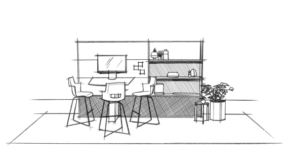 Open image tooltip
 Before
In this setting, users needed more tools to visually display their work and ways to provide additional privacy.
 Open image tooltip
 After
Steelcase Flex Screens provide shielding for displayed content while offering flexible control. Convenient access to collaborative tools and power promotes equal participation.
Another critical factor to designing a space that is functional requires that the furniture works well together. “Much like a task chair needs to be the appropriate height to relate to a desk, this same principal needs to be extended to shared spaces,” says Roush. For example, if a table is in the space and intended to be used in a lounge posture, it’s important that those two objects physically work together if you expect people to be able to get work done. Is the table in the space at an appropriate height relative to the seating so people can use their devices?”Finally, you must consider where these spaces are located in the overall floor plan. “You can put the same setting in two different places and in one area it works really well and it’s always highly utilized and in the other no one uses it,” says Roush. “And it’s probably because it’s not in the right place. Adjacencies and proximites are really important and you need to plan them thoughtfully, taking into consideration work modes and workflow.”
Things to consider
- Is the location appropriate for the type of work being done?
- Does the setting promote equitable eye contact?
- Are people a comfortable distance from one another for the intended activity?
- Are tools and technology within reach?
- Does the setting support people’s belongings?
- Does the furniture work well together from a dimensional standpoint?
Personality
Express the unique brand and culture of an organization to attract and retain talent
“Aesthetics still matter. Personality is how organizations can put their stamp on these spaces and communicate its brand and culture to its employees and visitors. You want to use personality as a tool — position that personality in the right places in the office and combine it with the other principles, and then you’re going to really be in the sweet spot of performance,” says Roush.
Everyone has personal preferences and responds differently so it’s also important to offer a range of aesthetic choices to individuals and teams.
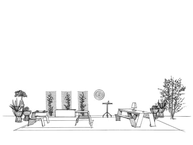 Open image tooltip
 Before
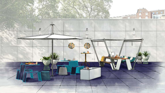
This outdoor setting needed a jolt of energy and protection from the elements to increase use.
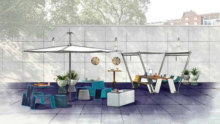 Open image tooltip
 After
User-adjustable shades allow access to daylight, protection from the elements and shielding from above. Lighting elements help to create ambience and additional amenities, such as games, coolers and greenery add personality.
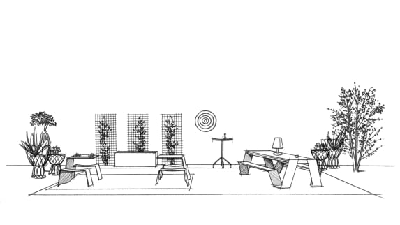 Open image tooltip
 Before
This outdoor setting needed a jolt of energy and protection from the elements to increase use.
 Open image tooltip
 After
User-adjustable shades allow access to daylight, protection from the elements and shielding from above. Lighting elements help to create ambience and additional amenities, such as games, coolers and greenery add personality.
Things to consider
- Are you balancing the level of performance with personality appropriate for the organization?
- Are you thinking about personality as a tool? i.e. wayfinding or team identity
Think holistically about the relationship between posture, privacy, proximity and personality.
Organizations are trying hard to create the kinds of places where people want to work and where they can get work done. No one wants to invest in a place that looks great but isn’t getting used, yet too often leaders look around their offices and wonder why some areas are popular and others sit empty. There is no one size fits all approach, but thinking holistically about the relationship between posture, privacy, proximity and personality will go a long way toward creating places where people feel a sense of psychological safety and can be productive.

