Designing the Medical Office Building of the Future
Five finalists competed in the NEXT Student Design Competition sponsored by Steelcase to create the medical office building of the future.
By Pasha Shipp, Steelcase Communications
What does the future medical office building design look like? Nearly 800 students from the United States and Canada took on the challenge of designing a 12,000 square foot medical office building to make care more accessible and convenient for the residents of Seattle. Their designs had to respond to the changes in the ways people are working as well as shifts taking place in the future of healthcare — patients being diagnosed with multiple complex conditions, technology transforming how care is documented and frequent innovations in care delivery.
As part of the 2017 NEXT Student Design Competition sponsored by Steelcase, each student was given the same parameters; design a medical office in an industrial part of Seattle, incorporate nature-inspired spaces, consider employee engagement and productivity as well as needs to collaborate.
Some visualized the healing power of nature, while others examined quality of light and color. Each design was unique. From more than 60 schools that participated, five finalists were flown to Steelcase headquarters in Grand Rapids, Michigan.
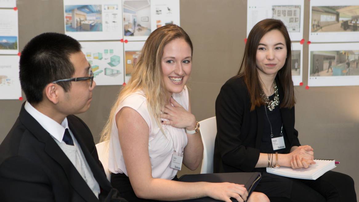
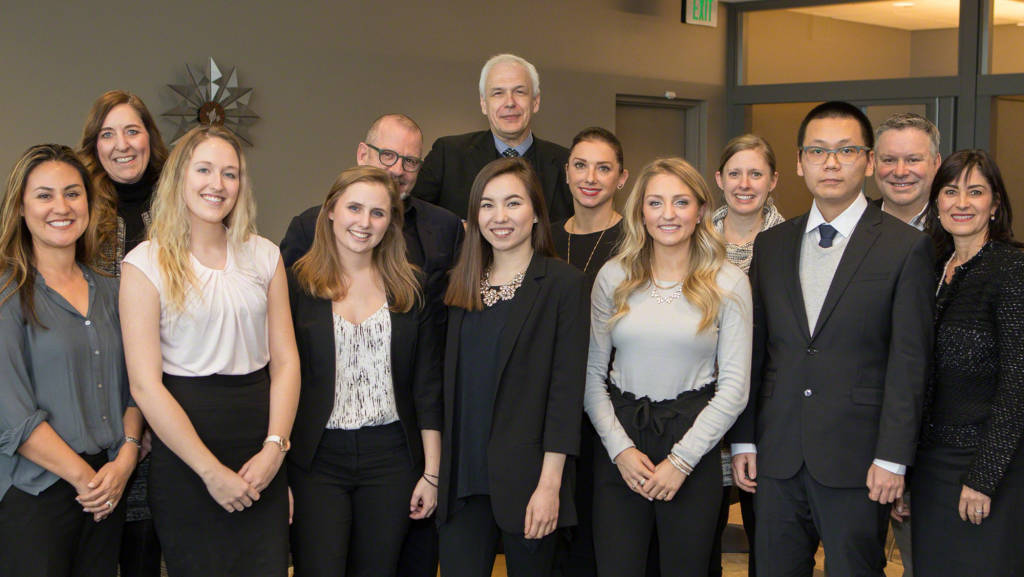
While in Grand Rapids, the finalists presented their projects and defended their design decisions to the panel of judges. They met with a design leader from Steelcase Industrial Design, had portfolio reviews with the judges to receive feedback and prepare them for interviewing and had dinner at the Steelcase-owned Frank Lloyd Wright-designed Meyer May House. The students also toured Steelcase’s wood manufacturing facility and received a hands on experience of the veneer selection process and toured Steelcase’s Grand Rapids campus to see how Steelcase has adapted its workplace to give people more choice and control over where and how they get their work done.
While only one could win, all of the finalists walked away with new insight into what it takes to be a professional designer, new lasting relationships and career momentum.
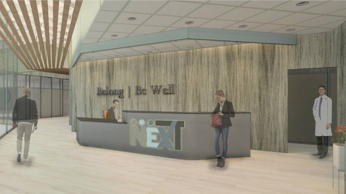
WINNER
Caitlyn Cathcart | Southern Illinois University
“The most impressive thing about Cathcart’s design was that it was thorough, client focused, concise and well edited,” said judge Tom Marquardt, HOK Vice President, Director of Interiors for their Chicago office. “It would have been a solution that –– had she worked for me –– I would have been proud to see her present such a client driven solution that responds so clearly to an extremely rigorous brief.”
Cathcart’s winning design blends color, pattern and circulation to achieve a space that prioritizes collaboration and creates a sense of connection and belonging. She tied the design to the community of Seattle. Cathcart says the assurance the competition gave her made the most impact. Receiving a cash prize for herself and her design program was an added bonus on top of a transformative experience.
“This opportunity helped me learn and grow tremendously as a designer while preparing me for my future,” Cathcart said. “The depth of this project pushed me to accomplish things I never had before.”
Cathcart is energized by her win, ready to pursue new design challenges. “This entire experience—from designing, to being in Grand Rapids—inspired me to be more curious and expand my mind,” she said. “Any chance that I get, I am going to start reading and researching things that will help continue my growth. I realize that I still have so much to learn and I am more than ready to start.”
Laura Morthland, Cathcart’s professor, couldn’t be more proud of her student. “It was such an honor to have her represent SIU as a semifinalist, but to know that she had won the entire competition was amazing,” she said. “She has always been a talented designer, but she often lacked confidence in her own ability. To see her walk through the competition and come out on the other end as the winner was one of the happiest moments I have had in teaching.” SIU has already decided to earmark its portion of the prize for a new scholarship called the “NEXT Scholarship in Interior Design.”
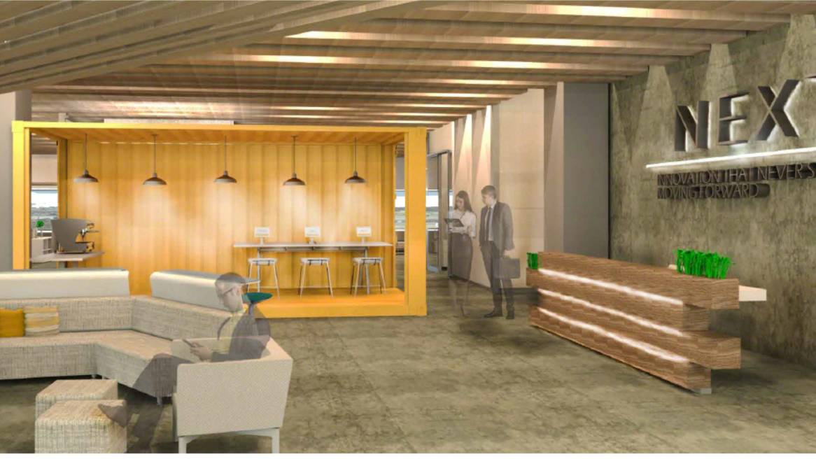
FINALIST
Kimberly Bracht | UNC Greensboro
Kimberly Bracht’s design drew from the seaport culture of Seattle.
“I was trying to get rid of the clinical feeling medical offices can have,” she explained. “I wanted it to be more approachable, edgy. I used shipping containers, inspired by the port of Seattle,” she continued. “A port of international trade, connecting the ocean to the interior. I used those containers to get rid of the medical feeling and connect the environment to the space.”
Of everything she experienced during the competition, the support her professor showed her along the way stood out.
“I have a mentor, my professor, Travis Hicks, who had a huge impact on this project,” Bracht said. “He walked through the project with me step-by-step. He sent it to other professors in the department to look at it,” she continued. “There was really a community aspect to it.”
FINALIST
Jessie Bean | Virginia Tech
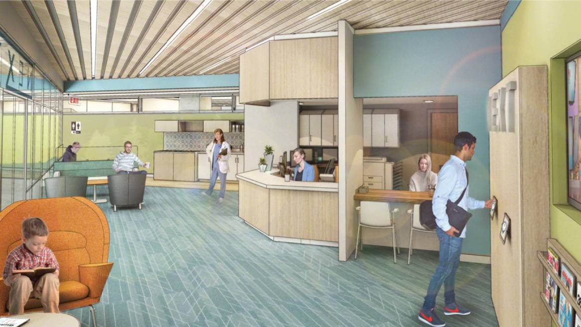
Evergreen trees inspired Jessie Bean’s concept. Bean used biophilia as the linchpin of her design — accentuating shared spaces with earthy tones and fun patterns.
“Nature was one of the biggest inspirations for my design,” Bean said. “I looked to the evergreens surrounding Seattle and used their density and hierarchy to inform my concept and space planning. I considered how plants are resilient in the ways in which they tolerate conditions of adversity and related that to how people are resilient in how they use clinical services such as our competition project, the NEXT Medical Office.”
Relationships are what Bean values most about the competition experience. “I wanted to be sure to make strong connections with people — other participants, judges and Steelcase,” Bean said. “I’ll be keeping and utilizing those connections for the rest of my career.”
FINALIST
Mikaila Kopcho | University of Minnesota
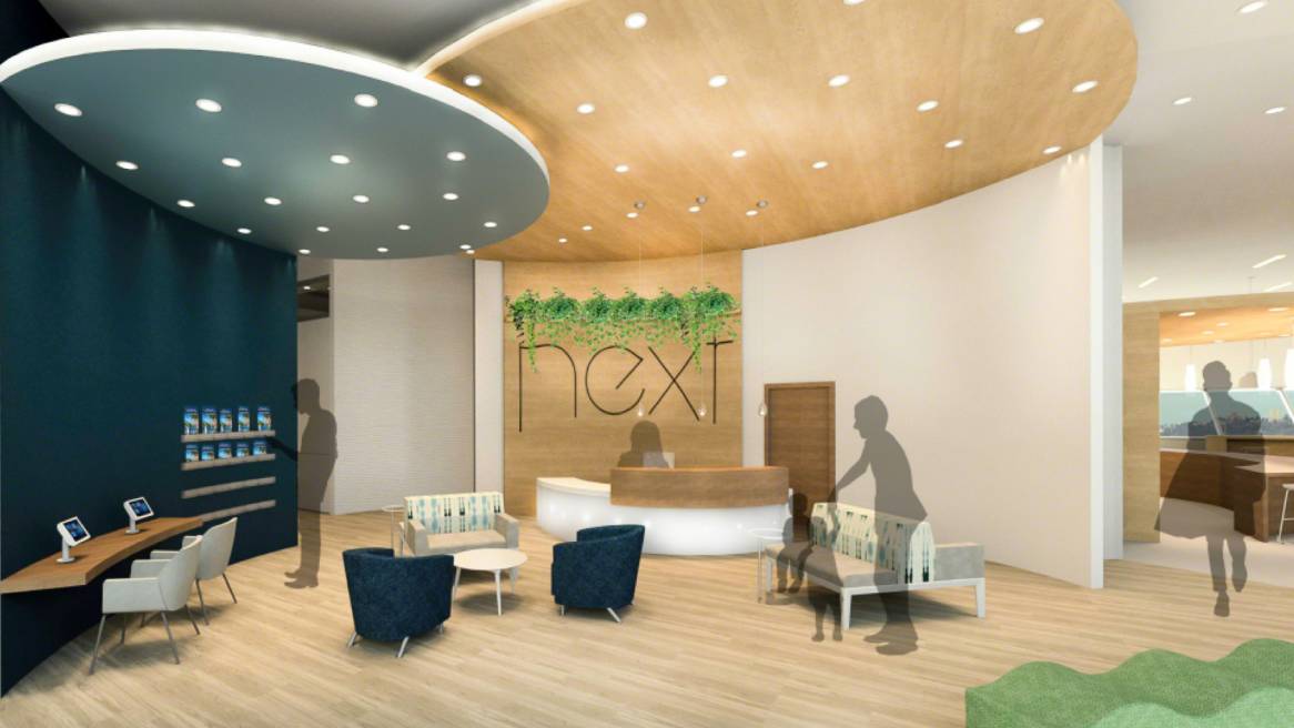
Kopcho’s design experimented with topography and layers, giving each space a unique, but cohesive feel.
“I did a lot of research,” she said. “I connected Seattle to mountains and outdoor activities. Looking at topographical maps, layers, and curves became the main inspiration for the design.”
More than anything, Kopcho left knowing the importance of being able to tell the story about how and why she developed her design. experience. “I’ve learned so much,” Kopcho said. “The biggest thing I heard is every design needs a purpose and story behind it. It’s something I’ll think about with every design decision.”
FINALIST
Wenhan Zhang | Columbia College Chicago
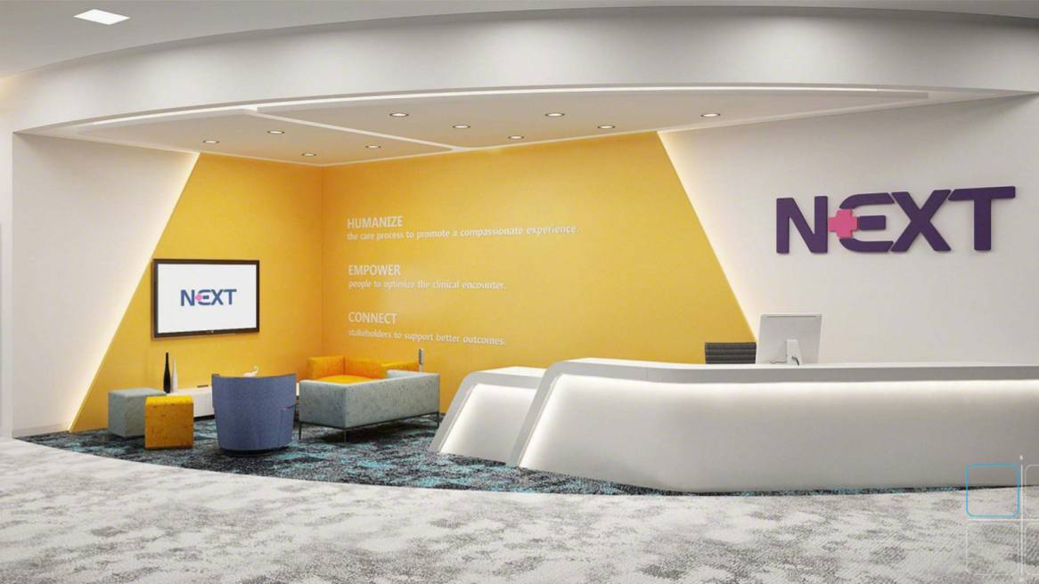
Circulation and geometry motivated Zhang’s design. His medical office balanced sleek, polished shapes and bright pops of color.
“I treated this project as not just a project, but also a way to help improve myself with process implementation,” Zhang said. “It was important to me that the function of the space created a relaxed, comforting environment for patients and employees.”
Of all the competition’s pieces and parts, he valued the portfolio revue most. Judges took the time to give each finalist personal advice to help them land a job in the future.
“The portfolio review was a great opportunity to hear how to improve. Learning to tell a story and how to deliver a good presentation in the future is so important,” he said.
Judge Ana Pinto-Alexander, HKS group director for health interiors, says each finalist should be proud of their tremendous accomplishment.
“They were all winners,” she said. “To make it from nearly 800 applications to one of five finalists –– that makes you a winner. They were all exceptional in every way,” she continued. “This should be an affirmation that they’re doing the right thing.”
Jerry Holmes, Steelcase Design Alliance Principal and co-developer of the NEXT Student Design Competition, says after five years of running the competition, he continues to come away inspired by these young designers.
“We intentionally make this competition very challenging. The client profile and program requirements are close representations to what these students can expect as they enter the design profession. We challenge them to do their own research, to apply their research through their design intent and ultimately connect their design solution to solving the clients business issues,” Holmes said. “If they can successfully achieve this through the NEXT competition, they are well on their way to being successful as a design professional. From what I have observed, the future of the design profession is quite optimistic and I am honored to have had the ability to impact the trajectory of their journey as a designer.”
See NEXT Student Design Competition to view more of the finalist’s work.

