Bobby Berk’s New Home Base
How the star of Netflix’s Queer Eye turned an outdated L.A. house into his team’s new home office.
Bobby Berk is known for custom, jaw-dropping (and often tear-jerking) designs on Netflix’s reality makeover show Queer Eye. Off camera, he runs a full-service interior design and creative firm that tackles renovations and new build construction along with a full line of licensed products — all while creating content for his blog, social media and virtual engagements. The team’s latest design challenge — turning an entire four-bedroom L.A. house into a full-functioning, inspiring workplace.
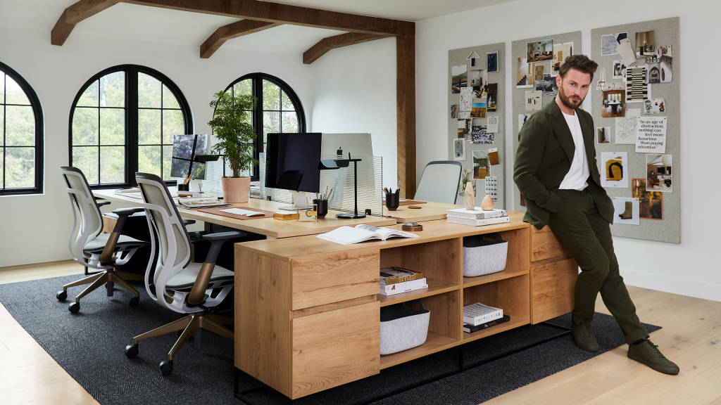
“People inherently feel most comfortable at home,” says Berk. “We wanted a space that feels like you can go sit on the couch outside or find a chair tucked away to work. During COVID, people realized how important it is to have a space where they feel comfortable.”
While many offices today are being designed to feel more like our homes, what happens when you need a home to feel more like an office? After several years of working from a smaller office in downtown L.A., and constantly renting homes for video shoots, Berk’s business needed a bigger, more multi-functional space.
“The design process really necessitates in person work to review samples, plan, create mood boards, and see and touch materials,” says Brady Tolbert, creative director at Bobby Berk. “It’s really hard to be super creative virtually. A lot more can happen when you touch, move and pin things up.”
The team wanted something refined, yet relaxed to meet very specific needs including a full materials library for the design team, a digital and creative studio to create content and rooms to showcase furniture, art and wallpaper.
GOOD DESIGN FEELS GOOD
Berk applied his design mission to his own workplace project. “We’re on a mission to help everyone discover that good design is good for the mind,” Berk says. “We want to design spaces that make you feel good when you’re there.” He wants to inspire people to live with clarity and mental wellbeing in the spaces they choose to spend time in.
“Interior design isn’t just about buying pretty things to impress friends or family. It should be about bringing things into your spaces that bring you peace and joy.”
Bobby BerkDesign expert, author and Emmy-nominated TV host
Berk wanted to create an office everyone could enjoy, feel comfortable and thrive in — where people feel empowered to be themselves and bring what makes them unique into the office every day. Every team member was invited to provide input on the design which included asking how they like to work.
DESIGN DECISIONS
Turning a home into an office meant the team had to rethink the layout of the entire space by opening things up and knocking down walls.
Bobby Berk’s Workplace Design Goals
- Variety – Allow team members to work from a range of spaces.
- Comfort – Create a feeling of home with the functions of an office.
- Privacy – Ensure everyone has access to privacy.
- Flexibility – Design each room to serve multiple purposes.
VARIETY + COMFORT
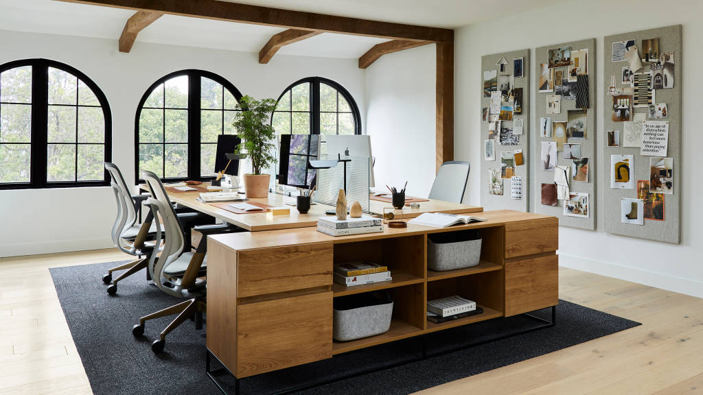
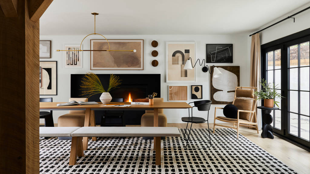
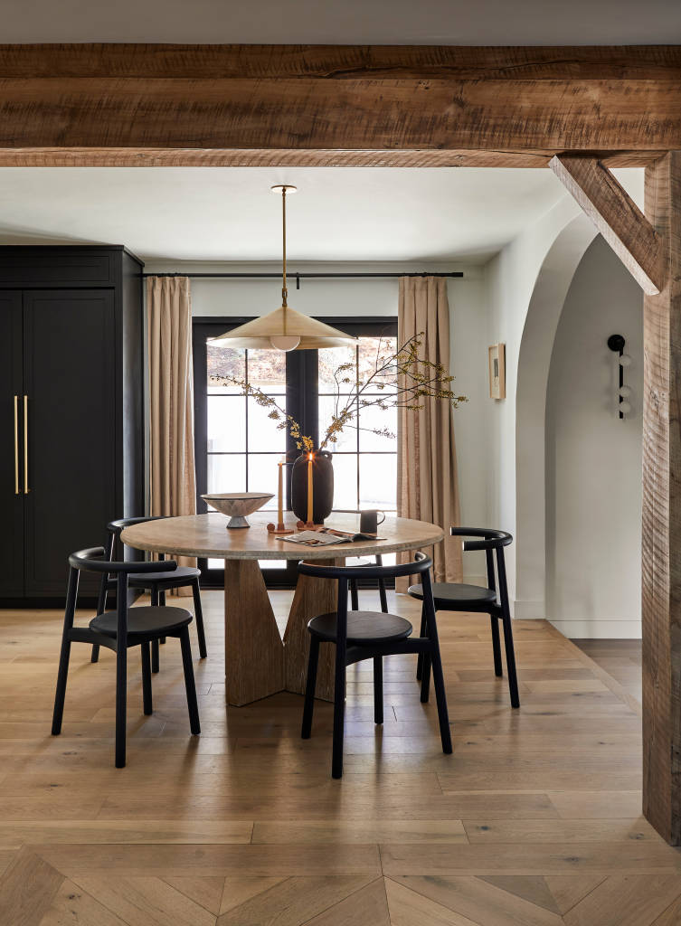
Upstairs the bedrooms became a big, functional work space. Downstairs, a more modern, connected layout creates a continuous flow which makes it easy to display an ever-evolving product line. Furniture pieces can be switched out frequently and quickly. Designers also made intentional decisions to use furniture and decor that would more traditionally be found in a home space.
Berk’s design team worked with Steelcase designers who have access to an expansive range of furnishings and solutions from the Steelcase Community of Brands letting them easily blend office needs with the comfort of home. Going for an organic modern vibe—think clean lines, a minimal palette, and earthy touches — Steelcase Design Services provided Bobby’s team with full renderings of their spaces so they could see how their ideas could come to life.
“We always co-create and collaborate with our clients. It’s important to us that we establish a trusting relationship,” says Amanda VanDuyn, Steelcase senior interior designer. “Bobby’s design team came to us with great ideas and an inspiring vision. We were able to put a spin on some of their ideas and provide them with creative options for showcasing their space in a different way.”
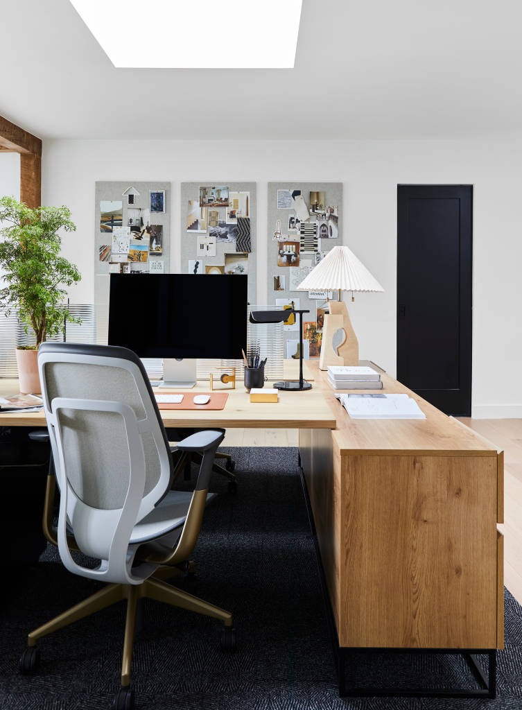
After working with VanDuyn, Bobby’s team visited the Steelcase WorkLife in downtown L.A. to see a wide variety of solutions in person. They worked with VanDuyn to select pieces and finishes that would seamlessly integrate and function well in the space — including finding ways to create more storage and surfaces for design materials.
“We wanted pieces that didn’t feel too ‘officey,’ that felt homey, but would stand up over time,” says Tolbert. “The office chairs we chose, for example, are so sleek and simple. They feel like the most luxurious office chairs without looking like office chairs.”
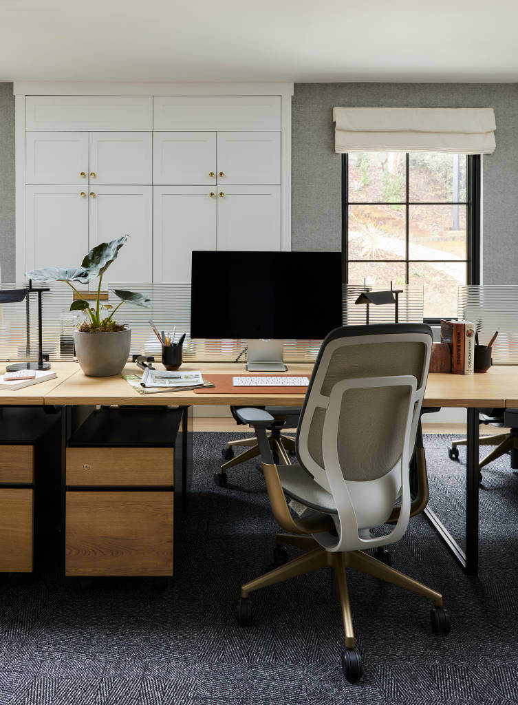
They also selected a number of custom elements like the modular sofa which let them put their own stamp on the furniture. And they needed high-quality furniture designed for a longer life cycle so it would not end up in a landfill despite repeated video shoots, hundreds of pounds of materials and samples and lots of collaboration – and fun – over time.
PRIVACY + FLEXIBILITY
The project started in 2019 which meant the pandemic gave designers a chance to rethink their needs.
“There’s nothing worse than doing a Zoom call in a big open space,” says Tolbert. “The pandemic reinforced the importance of having multiple work spaces to choose from — both open and enclosed. It also elevated the importance of flexibility.”
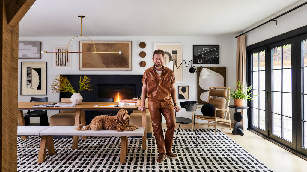
Designers needed spaces that could serve a variety of needs. The conference room is a great example. Bobby and the team gather there every week. They also host big group lunches. The large table and gallery wall can transform the room into a massive workspace to pull out samples, swatches and have vendor presentations. The doors along one wall accordion and allow people to work inside or out.
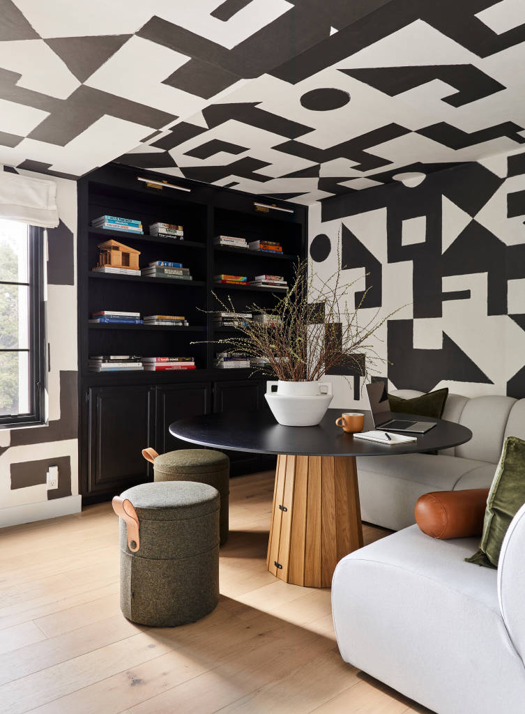
Hybrid work changed the office dynamic as well. While team members work in the office 4-5 days per week, hybrid gives them flexibility to balance work and life. Customer engagements that used to be in person and require lots of travel are now able to be virtual. The shift to more virtual meetings led to the design of a call room — big enough for 1-4 people — it provides for visual and acoustic privacy, and a bold background for a virtual meeting.
Years in the making, the team’s new “home office” is giving them everything they need to get great work done together and alone, connect with customers and partners, and feel really good at the same time.
