Top Student Designers Envision the ‘NEXT’ Hybrid Office
9th annual Steelcase NEXT Student Design Competition highlights the visions of next-generation designers.
While designing for an independent, underground fashion line out of a Los Angeles art gallery that doubled as his home, Elliott Beach couldn’t have imagined a new artistic outlet would change the trajectory of his career a short while later.
“In fashion, I was designing in a vacuum,” an emotional Beach said as he reflected on his career evolution. “I was an independent designer making clothes out of my apartment. Now, I’m designing with other people in a studio. I’ve been able to grow so much more as a designer.”
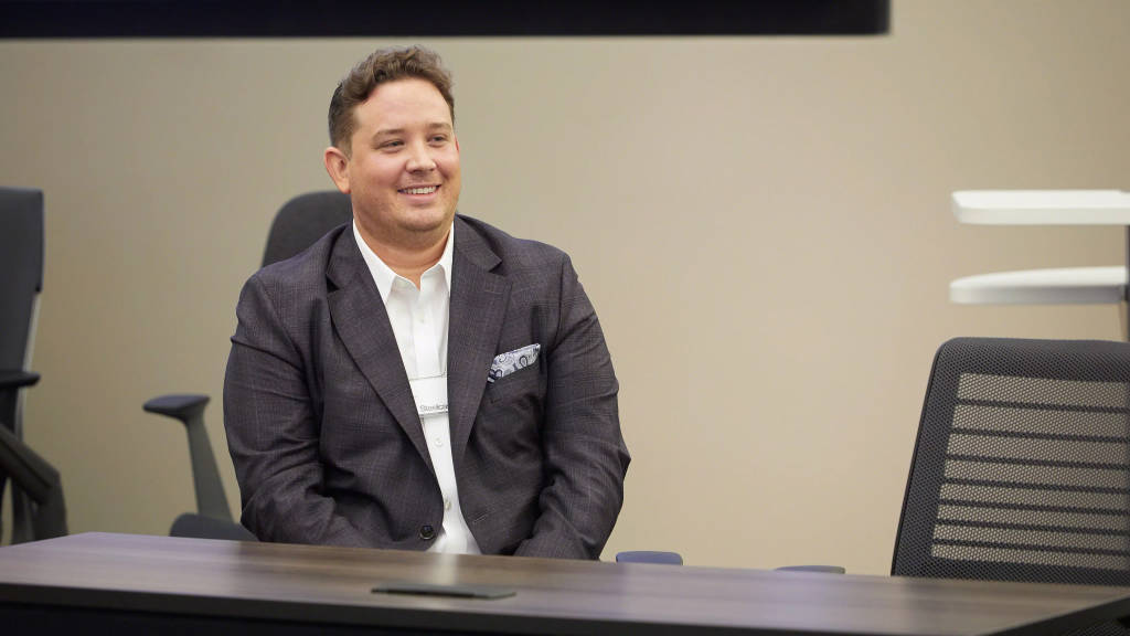
Beach now stands as the winner of the 9th annual Steelcase NEXT Student Design competition. But, his first place finish wasn’t a slam dunk.
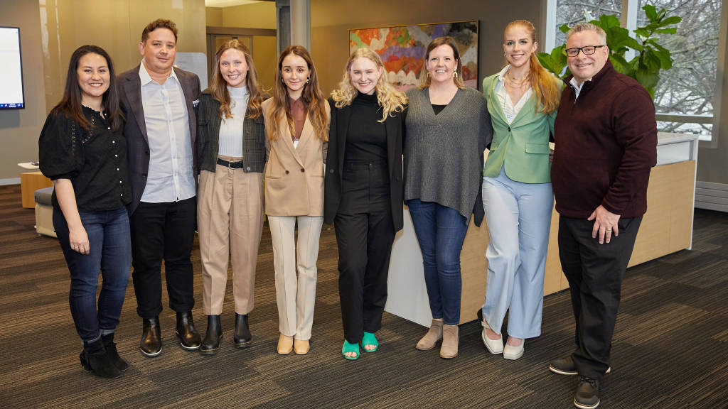
Thanks to one of the most talented crop of finalists to date, judges had the intense task of whittling a winner from the final five. Beach, competing on behalf of Maryville University in St. Louis, was joined in the top tier by Juliana Schwartz from Kansas State University, Molly Taylor from Mississippi State University, and Nevi Keser Gruskin and Morgan James, both from California State-Long Beach. Judges and organizers all agreed, the winning margin was razor thin.
“The caliber of the top five, the diversity of their submissions, the radically different concepts, the level of execution … It was the best we’ve ever seen as a group of five submissions that were all equally weighted after the first round. And it carried through to the formal presentations,” said Jerry Holmes, Steelcase Design Alliances principal and competition co-leader. “It was so challenging to get the judges to make a final decision.”
Contest co-leader and Steelcase Design Alliances Principal Denise Calehuff was impressed with the way the students were able to manage their projects while taking part in remote education. “This group of designers is just so talented, no matter what kind of learning style is coming at them, they’re going to adapt,” Calehuff said.
The Competition
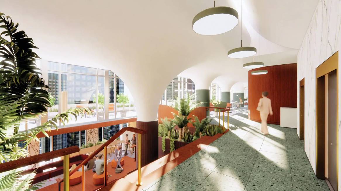
Nearly 1,000 student designers from 76 interior design programs across the U.S. and Canada were charged with visualizing a new satellite office for a fictional, socially-conscious, minority-owned cosmetics start-up called ‘NEXT.’ Students were asked to conceptualize a plan that would meet the physical and technological demands of a post-pandemic hybrid workplace but also integrate the company’s core values and draw inspiration from the company’s diverse and multicultural New York City neighborhood. The made-up beauty company was founded by a woman who emigrated with her family from Korea as a child, driven to create a more sustainable and culturally-inclusive line of beauty products. The new 15,000-square foot space was to be situated on two floors where employee health and safety, and work mode flexibility were also top priorities.
The Judging
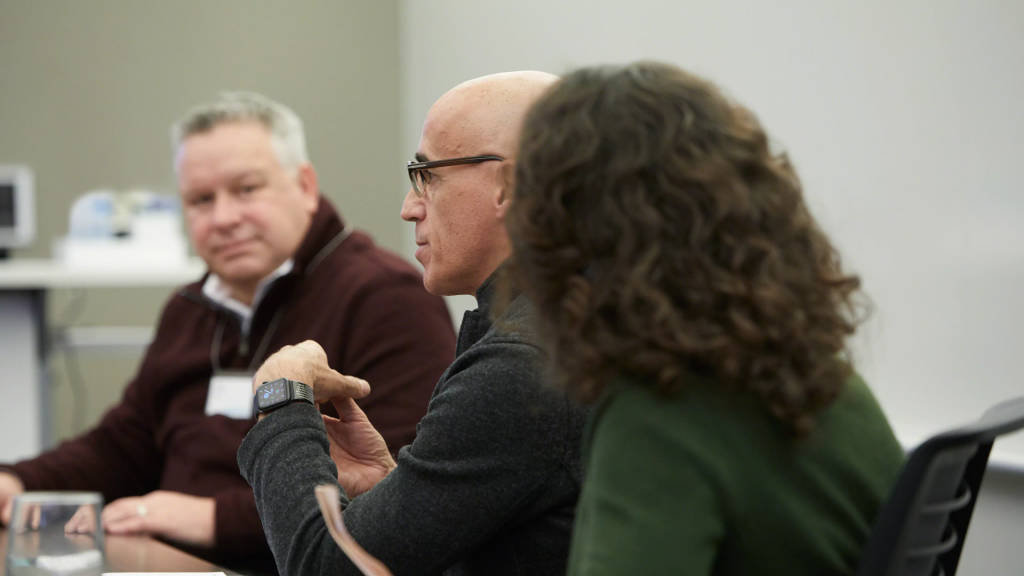
The competition is decided by a panel of seven esteemed judges from top design firms all across the country. The group spent months deliberating hundreds of designs, culminating in the top five visiting and presenting at the Steelcase Grand Rapids, Michigan campus.
After hearing the presentations, the judges had the unenviable job of choosing a winner. Sequestered away in a lounge area on campus, judges agonized over the selection.
“It’s a five-way tie,” said Bouchey. “This is one of the hardest decisions we had to make, which is a testament to all of the contestants.” They debated for an entire afternoon, before finally arriving at their decision.
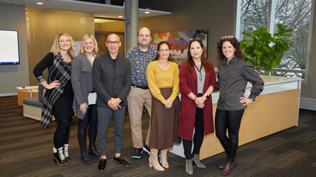
“This shows that the future of design is in great hands,” said competition co-leader Jerry Holmes. “We want to help facilitate that.”
“On behalf of this group, Steelcase gave us this gift of asking us to participate, and it truly is a gift to have come to know you (the contestants) and it’s a gift that you all are truly deserving of,” said Bill Bouchey, HOK design principal.
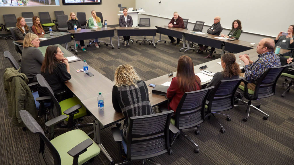
Following the announcement of the winner, each student received personalized one-on-one feedback with each of the judges to help them understand what worked and what could be improved upon. The contest is meant to mirror the rigor of a real client presentation, and the judges agreed that performing well in the contest sets students up to be successful in the real world of interior design.
WINNER: Elliott Beach, Maryville University

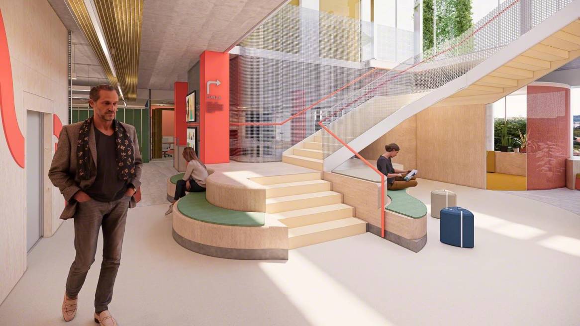
Beach’s design emulated not only the uniqueness and vibrancy of New York City, but the NEXT Company as well. Beach framed his project with an emotive and colorful mood board based on New York City’s Fashion Week to demonstrate his palette and texture choices. That set the table for the ‘pride of place’ reflected throughout the design. Beach said the emphasis on natural ingredients within the cosmetic product informed his decision on using organic curves and shapes in the layout. He also focused on building a space that capitalized on the unique uses of the furniture.
“He excelled in two voices, he put himself in the client’s shoes by speaking with empathy” said Holly Christian, design principal at Little Diversified Architectural Consulting. “But he also spoke as an expert to solve problems.”
The judges were impressed not only with Beach’s design but also his smooth presentation and ability to take the judges on a journey through the space via his storytelling. “I did have a very simple, pragmatic concept but it was a direct response to what the client wanted,” Beach said
Molly Taylor, Mississippi State University

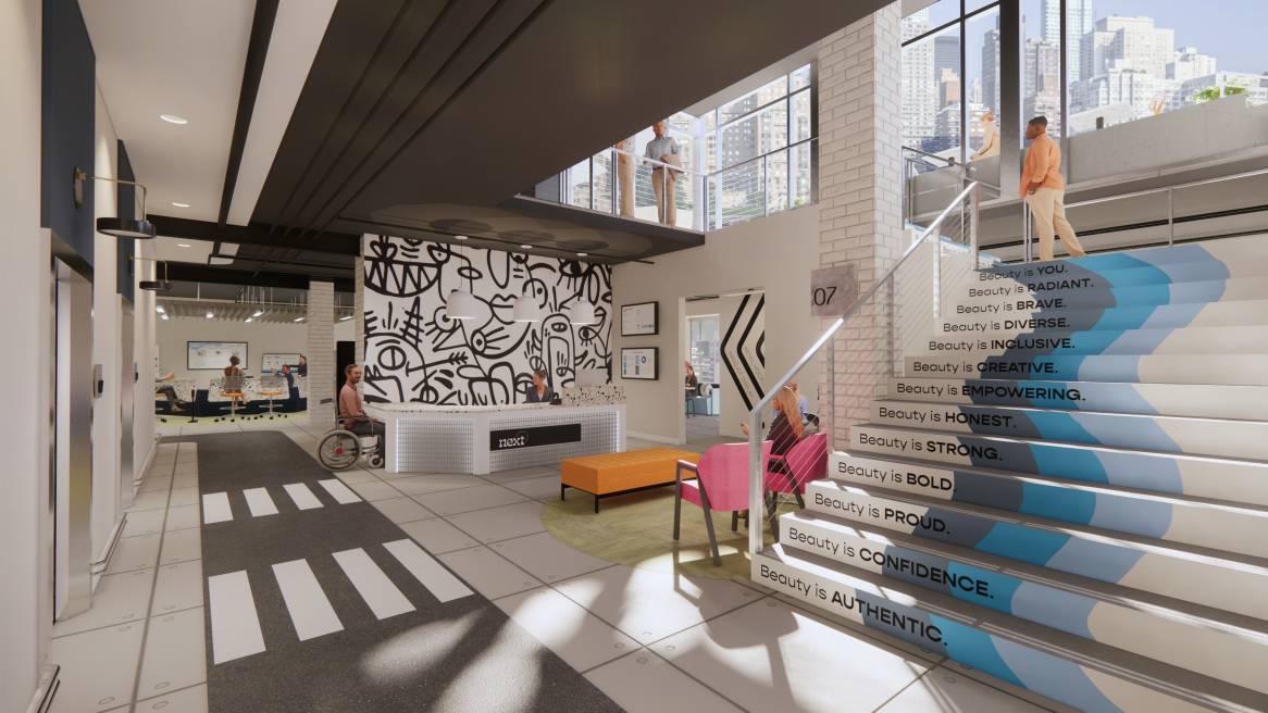
Molly Taylor’s design made no bones about bringing the city into the space, mingling a diverse array of materials, street art, lighting and wall applications to recreate NYC’s eclectic and electric vibe. The design heavily features unique and vibrant street art along with elements of urban life such as crosswalks and ‘traffic areas’ designated by darker floor applications meant to mimic asphalt. Taylor’s design was influenced by the melting pot of cultures in New York, and the physical arrangement of space was informed by the efficiency of the city’s street grid.
“Everyone appreciates beauty in a different way, and I wanted to translate that to the company and the brand as well,” Taylor said.
“We loved the attention she paid to the visitor journey, and the huge amount of background and reasoning behind all the elements of the design,” said Sandi Rudy, senior interior designer for Cushing Terrell. “She really directly addressed the idea of wellbeing throughout the space.”
Morgan James, California State University-Long Beach

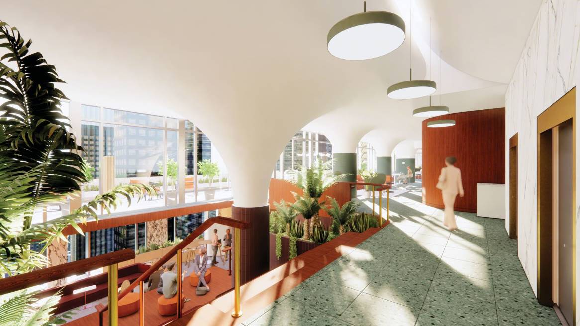
Morgan James’ NEXT design was as cerebral as it gets – literally. James centered her design on human biological makeup, for instance, linking NEXT’s brand identity to a fingerprint icon, and designing spaces based on the natural functions of alpha and theta brain waves. Those themes, along with a DNA helix, carried throughout the physical design. As a result, James was able to devise what the judges called a “superb” arrangement of space across the two floors.
“The storytelling was done masterfully and that is such an important part of what we do as professionals. We need to narrate the emotional experience of how the user would interact with the space,” said Mary Cheval, design principal at Ware Malcomb. “The expression of the user experience was absolutely brilliant, particularly as she introduced the concept of a customizable app. She had all of us wanting to download the app right now so we could experience it for ourselves!”
For James, the entire NEXT experience with Steelcase was life changing. “This project easily became my life. It became my passion project and it just brought so much meaning into my life and opened doors I never thought were possible. I thought no one would like it, and I was wrong. It means so much – I feel like I’m just redeemed,” James said.
Nevi Keser Gruskin-California State-Long Beach

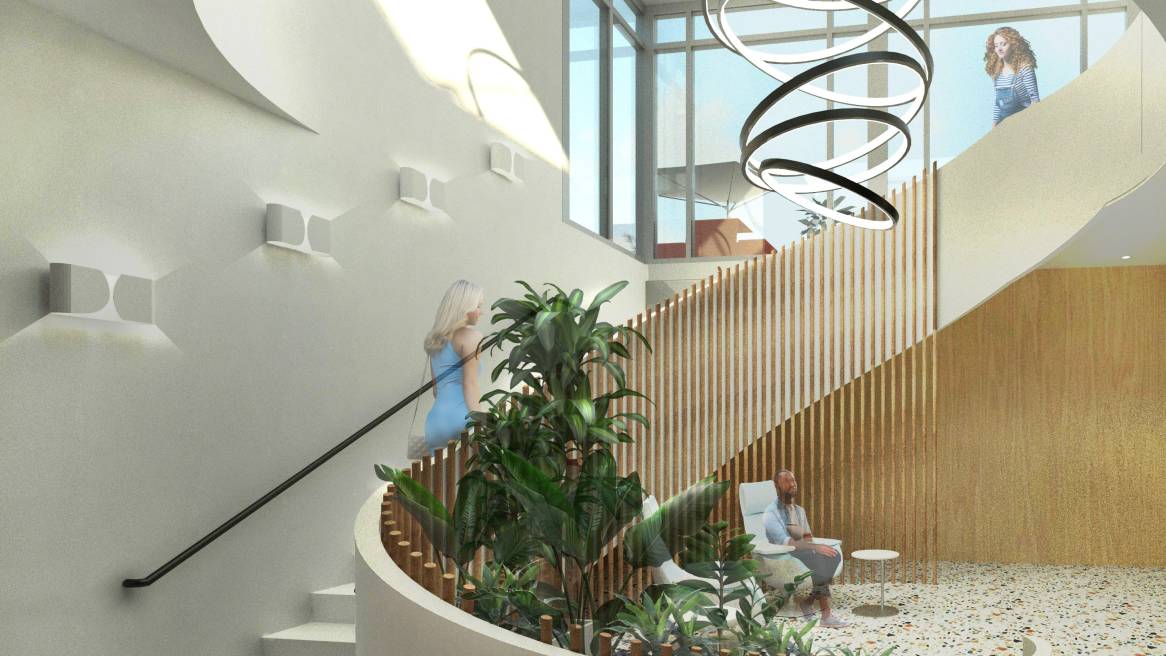
“Weaving Stronger Paths,” was the motto of Nevi Keser Gruskin’s work and the theme was evident throughout. Gruskin took the idea of social interaction braided with racial inclusivity to literal lengths by weaving strands of different materials together to form walls, ceiling applications and other design elements.
“The three big elements that dictated this project were location, Steelcase furniture and the company brand. I didn’t want to just focus on one. I wanted to play on the diversity aspect, the sustainability aspect and I wanted to come up with a clever way to tightly interweave all of them,” Gruskin said.
The judges were attracted to that theme. “There was a sense of belonging and connectedness with all of your staff and to your company mission,” said Erika Moody, design principal at Helix Architecture + Design. “The design really informed the culture. It would drive the culture.”
Juliana Schwartz, Kansas State University

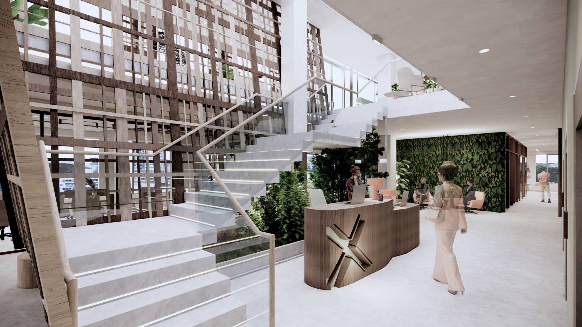
Juliana Schwartz began her project by understanding what made New York City, home of the fictional NEXT company, possible. In short, the bedrock upon which all of its high-rises are built. That research informed Schwartz’ unique design elements, as she incorporated bedrock form, shape and appearance throughout the space.
“It was obvious once I learned that the bedrock below New York City is what allows it to exist. It easily transferred into NEXT as a physical space and perfectly helped support people from a spectrum of neurological abilities,” Schwartz said.
Judges also remarked on her stark and contrasting color themes. “It was really nice to see how the color theory worked with the broader design of the project,” said Steve South, design director of Spectorgroup. “She really thought about the future of work. The way the spaces work together was thoughtful and needful, and felt fresh and new.”
Steelcase Architecture and Design Manager Eydie Voss also loved the design. “She nailed it. It was the right balance of a lot of things. It’s obvious she spent a lot of time figuring that balance out.”
To see all of the work and fine detail that went into the students’ designs, check out the NEXT competition page.

